30+Legacy tools to migrateFrom a back office of separate tools into one platform
36Components publishedPlus 167 icons and 56 colour tokens, in Figma and in code
HoursDesign review, not daysAn agent checks every new tool against the real system
The challenge
adiadmin is adidas’ new back office: one platform where the teams behind Digital and Ecom manage content, campaigns, membership, events and stores, each through its own tool. Underneath, more than 30 tools ran on two component libraries, and every domain had forked its own version. Nobody owned the foundation, so nobody fixed it.
The work
Working alongside another product designer, I helped build admin v3.1, the design system underneath adiadmin, and the AI agents that keep it in sync with code, built with engineering in the same GitHub repository. I also helped shape how design and engineering work together. Nobody asked us to. We saw a problem touching every team and built something that scales.
01 · The starting point
Two libraries, and every domain its own
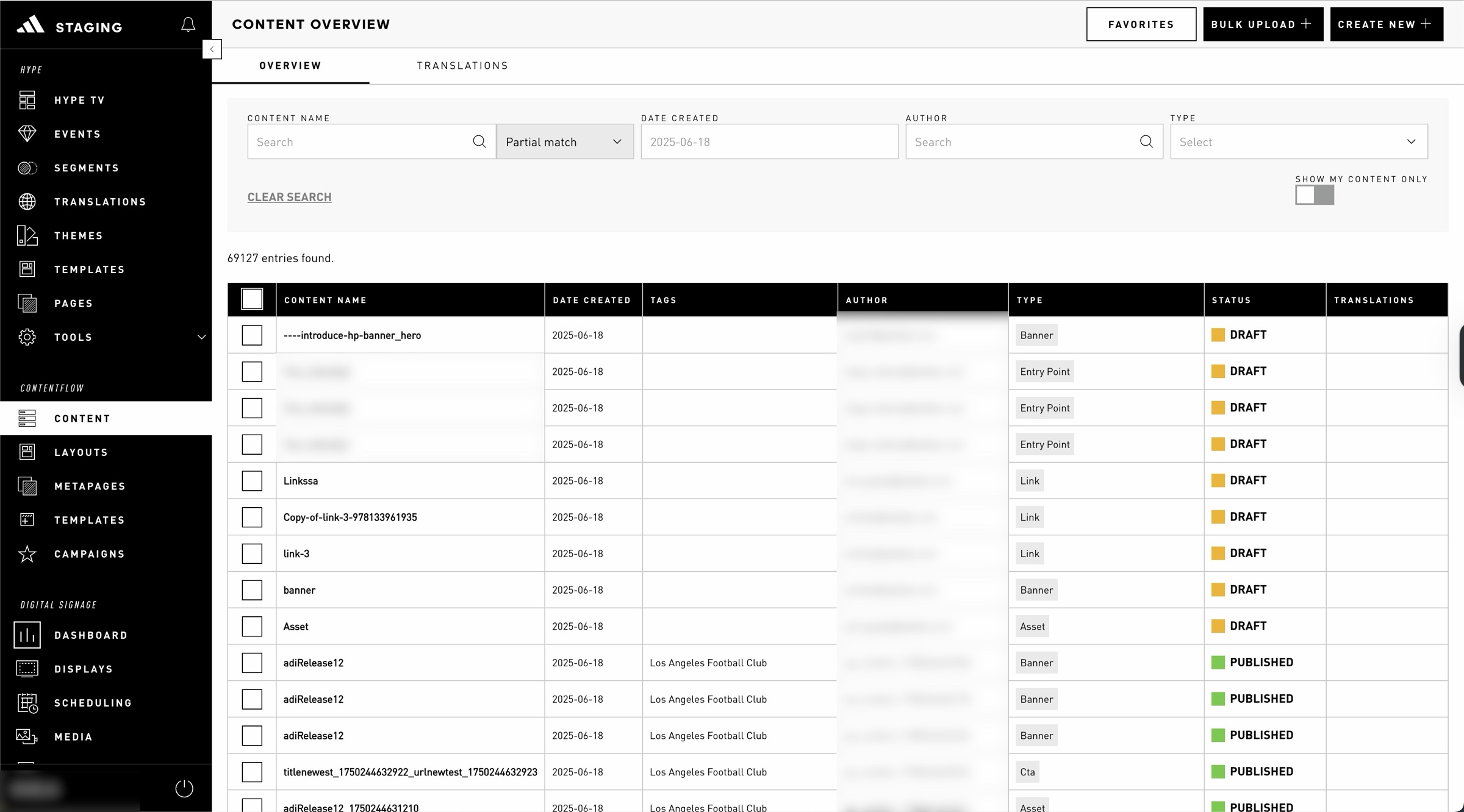
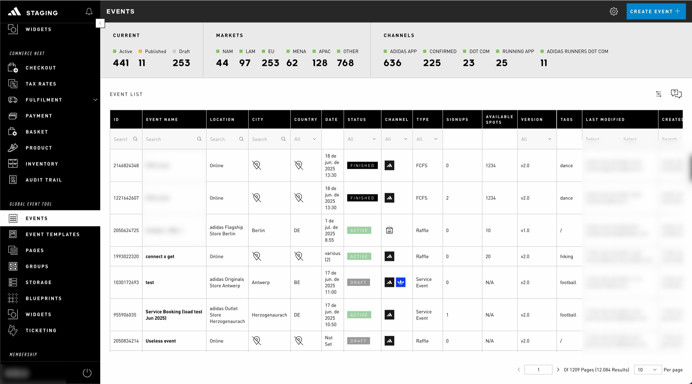
The back office ran on two versions of the component library, used inconsistently across domains. The second had never been released in code. Each domain had modified components freely, with its own logic, props and naming, so pieces from different teams couldn’t sit in the same view without breaking.
Figma told the same story. Components without real variants, designers detaching them to rebuild locally, names that didn’t match what engineering shipped. Every handover was a translation, and every fix was local.
Before: each tool solved the same table, filters and states its own way.Dense, monochrome and hard to scan, with no shared hierarchy.
02 · The decision
Nobody asked us to
It surfaced while we were designing a new domain that had to combine functionality from several others. Neither library could do it. We could have patched our corner and moved on, the way every team before us had. Instead we stepped back and mapped the problem: the bugs from mismatches, the rebuilds, the fragmented handovers. It wasn’t our domain’s problem. It was the platform’s.
So we picked up the early v3 the Admin Core team had started and pushed it into v3.1, a shared foundation open to every team, adoptable at each team’s own pace, with a compatibility layer so old and new components could live side by side. Seeing a problem that touched everyone and proposing a fix that scaled is what opened the door to engineering.
03 · The system
A system with logic, not just visuals
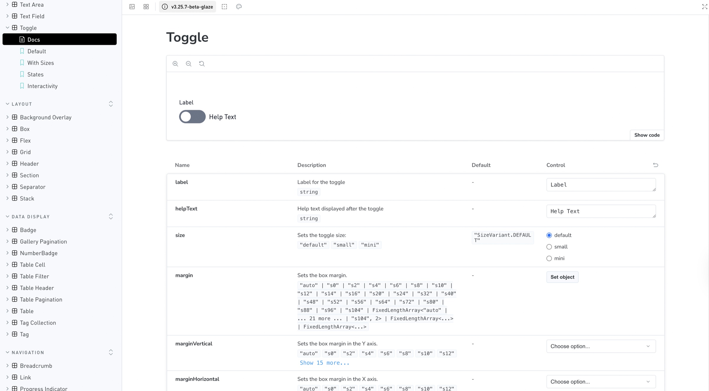
v3.1 rebuilt the components from scratch with props and variants that actually work, so designers use them in Figma without detaching. Names, props and behaviours are the same on both sides. Tokens and themes can be scoped per micro-frontend, so each tool can carry its own context without leaving the system.
Some decisions are small and deliberate. Corners are sharp by default, for precision in dense tools. Text inside components is trimmed to cap height so labels sit optically centred. The documentation even carries a guide written for AI agents. The system is meant to be read by people and by machines.
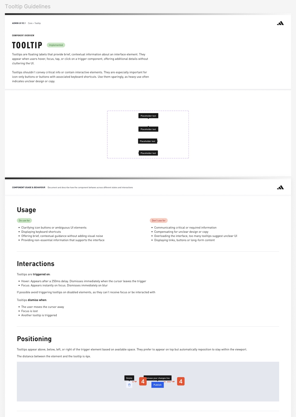
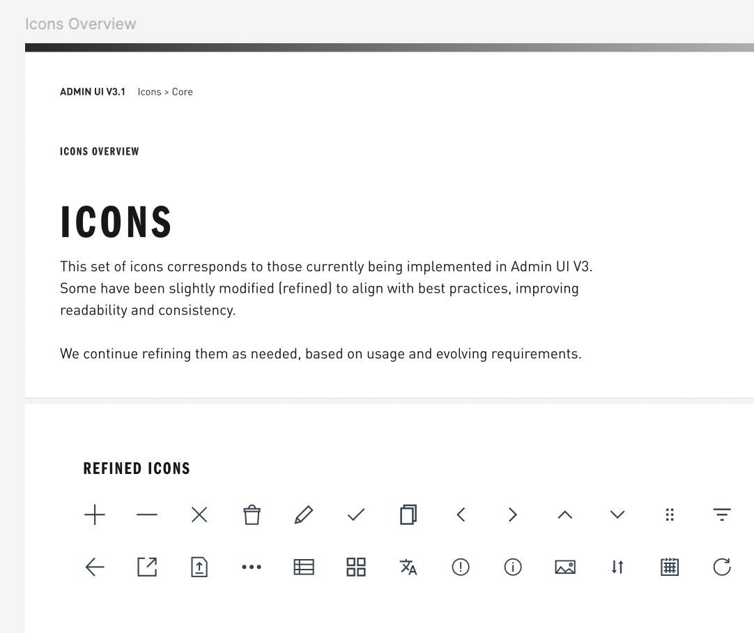
Every component documented the same way: what it is, when to use it, how it behaves.167 icons, refined for legibility and consistency.
The same component on the engineering side, documented in Storybook with the same props.
04 · Working with engineering
One repository, one language
The collaboration changed shape. Instead of handing over screens, we worked side by side with engineers defining props, variants and behaviours. From the design side, I helped organise how that collaboration runs: how a component is requested, reviewed and released, and who decides what.
Then we went further and built AI agents together with engineering, in the same GitHub repository as the components. The system stopped being something design hands over and became something both disciplines maintain. The first agent already cut design review of a new tool from days to hours.
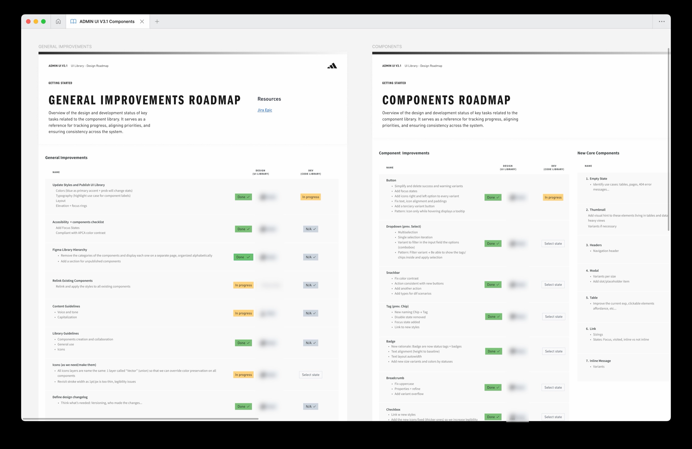
One roadmap for both disciplines: every task tracked in the UI library and in the code library.
Figma library⇄GitHub repo⇄Storybook
In use
Figma and code, in sync
Keeps the Figma library aligned with the components in the repo, so every new tool is reviewed against the real system, not a screenshot of it.
In progress
Prototypes that ship
Designers prototype in Claude Code and the result already uses the repo’s components. Developers refine instead of rebuilding.
Next
A system that fills its gaps
When a component is missing, it gets created in the repo, in Figma and in the Storybook docs at once, instead of being improvised locally.
05 · Where it landed
A platform others can build on
adiadmin now runs on v3.1. The first tool built on the platform, Pulse Studio, is live, and the remaining 30+ legacy tools are migrating at their own pace. Next is governance: a core team alone becomes a bottleneck, and a fully open library bloats. Defining the space between those two is the work being done now, with the wider design team.
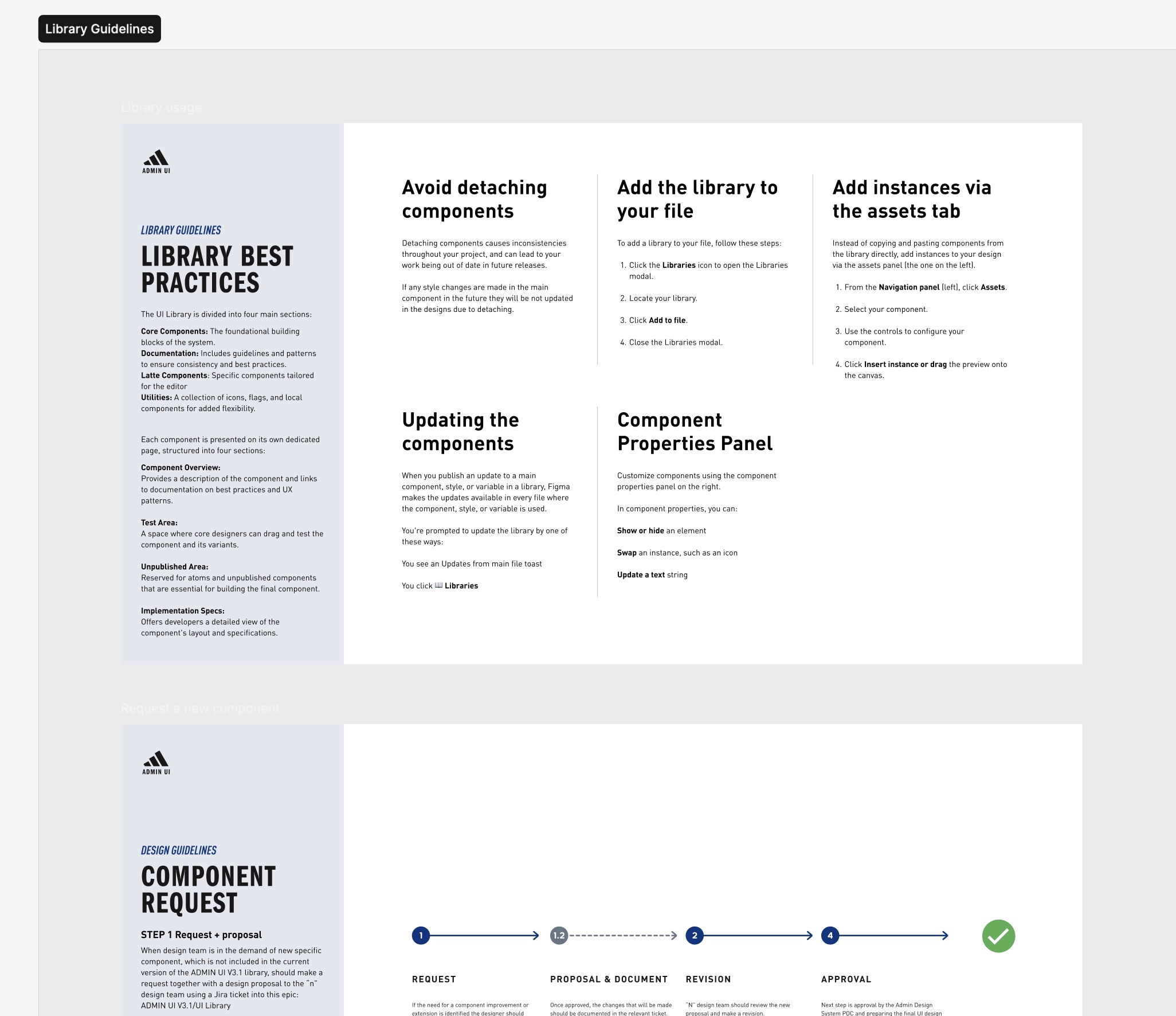
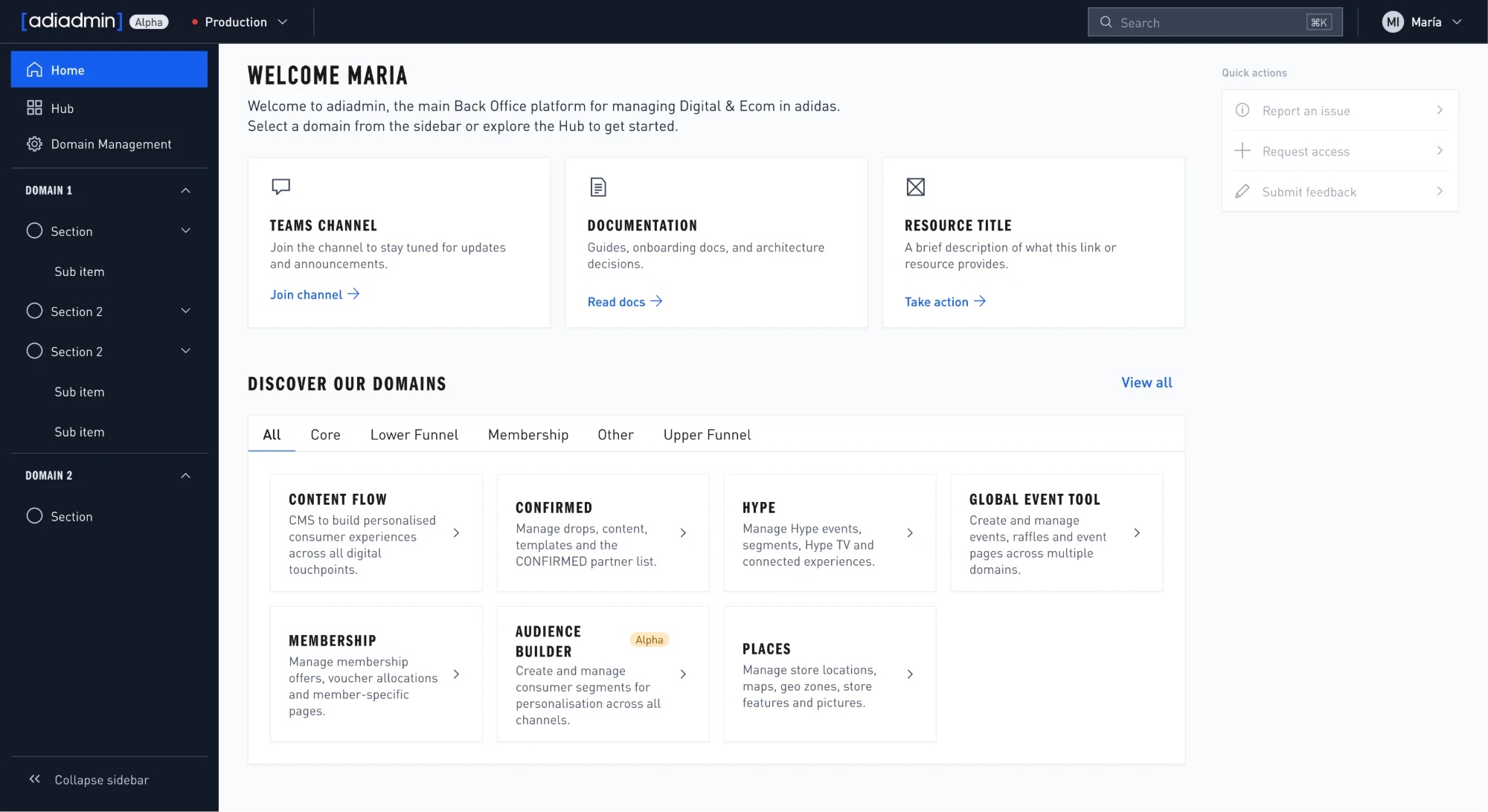
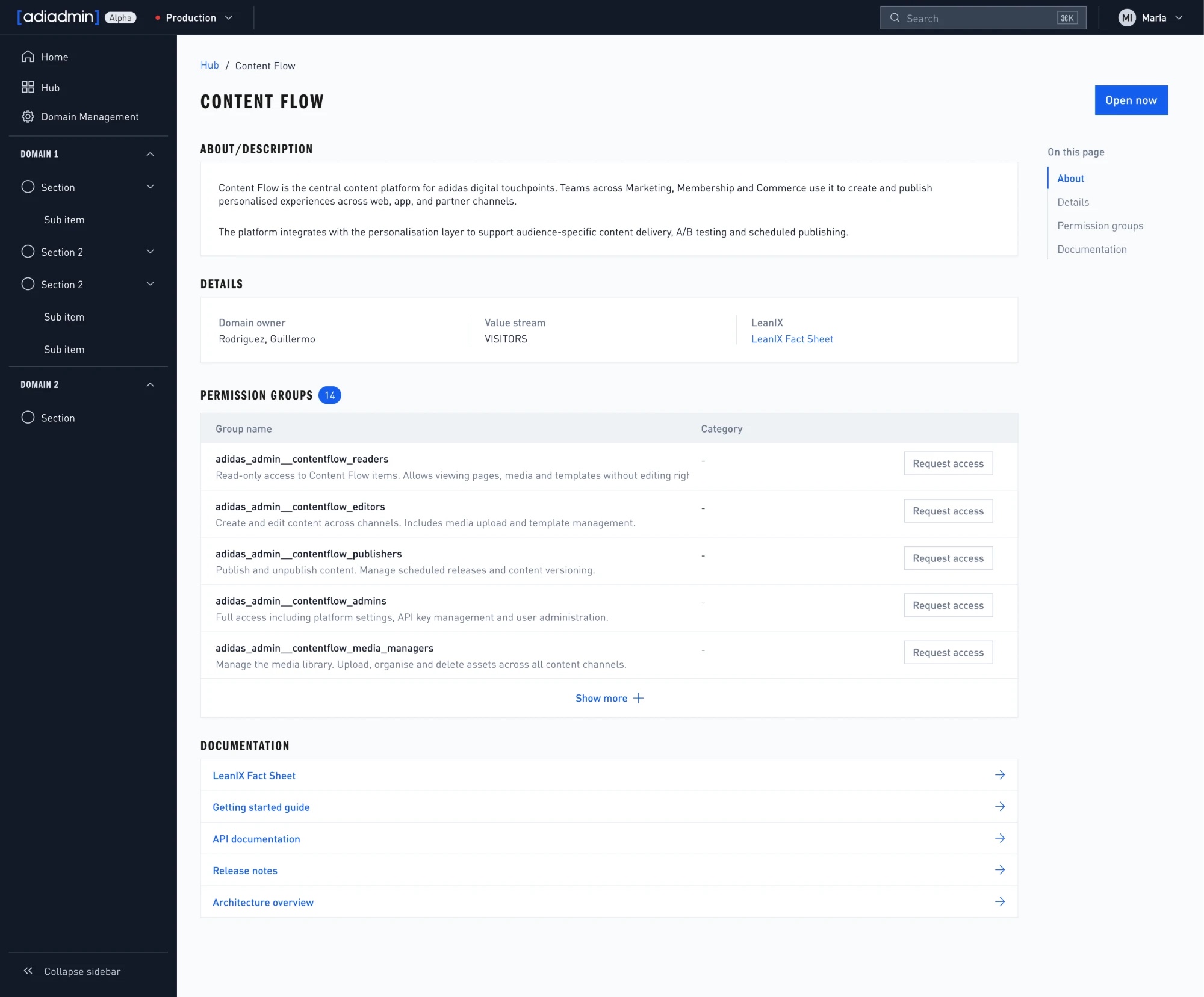
The first rules of the game: how to use the library, and how a new component gets requested, reviewed and approved.The adiadmin home, built entirely from v3.1 components.Each domain gets the same structure: what it is, who owns it, how to get access.
Internal tools rarely end up in a showreel. Nobody outside adidas will see this system, and most people inside only notice it when it’s missing. But every campaign, drop and store update passes through these screens before it reaches anyone. It isn’t the flashy work, and it still has to be done, and done well. The least visible design work is often the one everything else depends on.
"Thanks a lot for making the Pulse Studio launch possible, very smooth collaboration with a lot of hands on support."
Pilot team lead
"The UI looks fantastic, and honestly, this change has been long overdue."