Wallbox · IoT · Consumer App · Design Operations

Making energy management feel effortless

Timeline 2022 – 2023
My role Product Design Manager
Scope Design Hub · App redesign · Design system
App store rating 2.64 From one of the worst-rated apps in its category to a product users recommended.
Connection success 8396% Charger-to-app reliability — the most common complaint, resolved.
Delivery speed −40% Faster from concept to shipping once the design system was in place.

Three teams. Three products.
No shared language.

Wallbox made award-winning EV chargers used in homes and offices across five continents. But the software that made them smart — MyWallbox, the Business Portal, and the HMI on public fast chargers — was built by teams that barely spoke to each other.

The consumer app had a 2.6-star rating. The Business Portal was actively avoided by fleet operators. The charger HMI was designed from scratch every time a new hardware model shipped. None of these were interface problems in isolation. They were the visible symptoms of a deeper issue: design had no seat at the table, no shared methodology, and no way to scale.

"The charger is beautifully designed. The app makes me feel stupid."

User interview, March 2022

Teams were reluctant to involve design in their process. There was constant churn in focus and priorities. Three squads working on the same product ecosystem had no coordination, no shared components, and no rituals that brought them together. The problem wasn't a lack of talent — it was a lack of infrastructure.

Design the team
before you design the product.

My first move wasn't to redesign any screen. It was to design the conditions that would make every screen better — permanently. I proposed and built a Design Hub: a shared operational structure connecting three previously siloed squads under a common way of working.

The hub had three components: one designer embedded per squad, contributing to and drawing from a shared design system; a 360° team model that formally connected Design, Engineering, QA, Product, Data, and Content; and a full calendar of ceremonies built from scratch — none of which existed before.

The goal was to make good design structural, not accidental. When teams share a system and shared rituals, quality stops depending on the right person being in the right room.

Weekly

Design Weekly

All designers sync on work in progress, blockers, and upcoming decisions. Created visibility across squads that didn't exist before.

Per sprint

Design Review

Structured critique before handoff. Reduced back-and-forth with engineering by catching misalignments early.

Bi-weekly

Home Demos

Cross-squad showcase of shipped work. Built a culture of visibility and made design progress legible to the whole organisation.

Per sprint

Tech Alignment

Design and engineering in the same room before screens go to production. Caught feasibility issues at the sketch stage, not in QA.

Three product surfaces.
One coherent system.

The Design Hub covered three distinct product surfaces simultaneously — each with different users, technical constraints, and maturity levels. Managing this breadth required systems thinking, not just screen-level craft.

Decisions made in the consumer app rippled through the Business Portal. Components built for the HMI fed back into the design system. The work was only coherent because there was now a single thread connecting all of it.

Consumer

MyWallbox App

End-to-end redesign of the primary consumer product — from charger control and scheduling to energy insights and onboarding. 84% of all app sessions passed through screens that were rebuilt from scratch.

B2B

Business Portal

Fleet and building management for commercial operators. Redesigned alongside the app to create coherent system behaviour across user types, with shared components drawing from the same design system.

Hardware UI

Fast Chargers HMI

UI Kit and interaction model for public fast-charging stations. Created a reusable framework that eliminated the "design from scratch" approach that had produced inconsistent hardware UI across product lines.

Internal

Design Workflows

Tooling, documentation, and processes that made the design team itself more scalable — Figma structure, component governance, ZeroHeight integration, and onboarding for new designers joining the hub.

A shared contract
between design and engineering

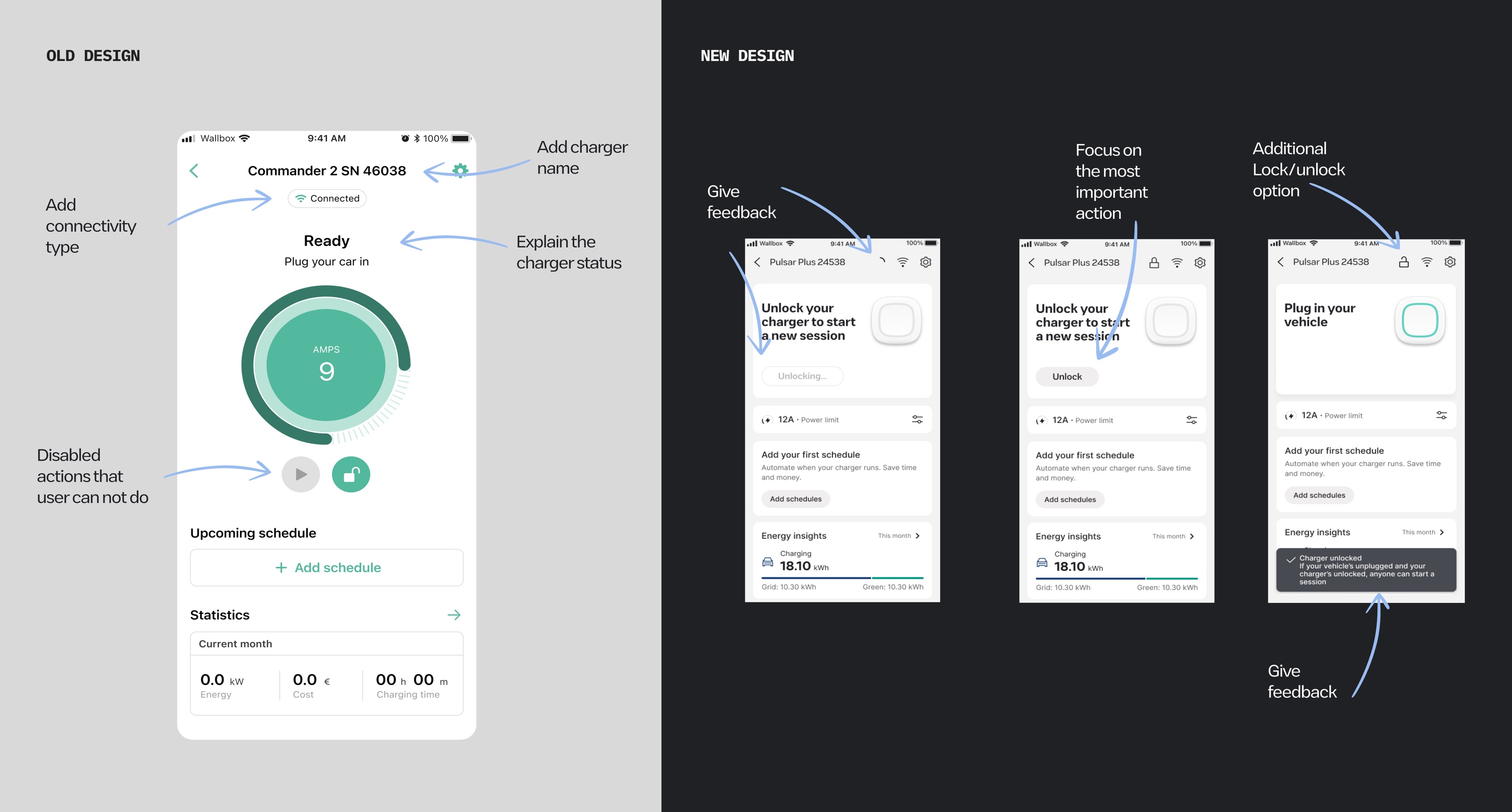
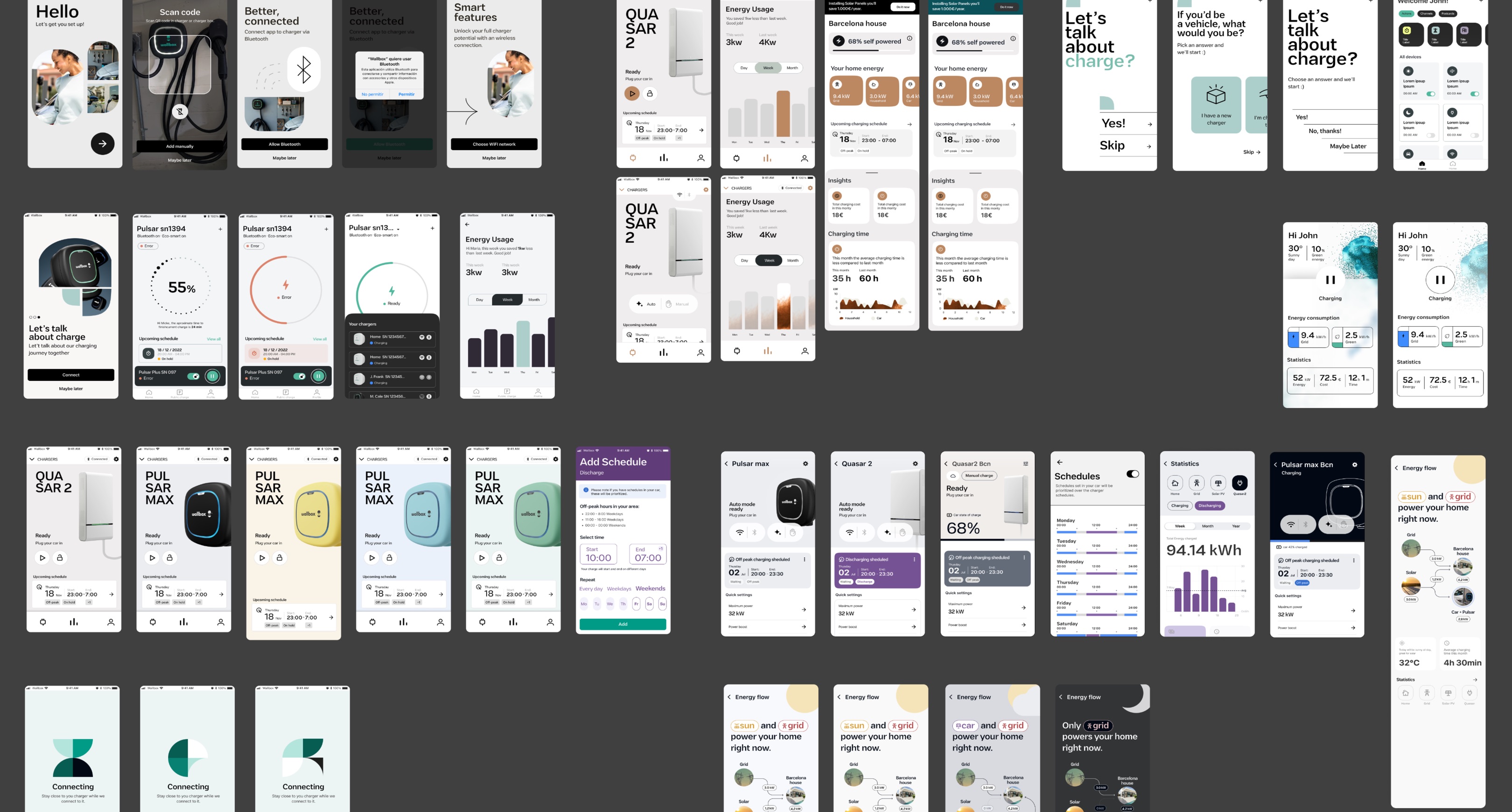
Before the design system, each squad built components independently. The same button existed in six versions. Designers recreated things that already existed. Engineers were never sure which version was correct. Every handoff reopened the same debates.

We built the system in parallel with the redesign — not before it, not after it, but alongside it. Every screen we designed either used an existing component or created a new canonical one. Documentation lived in ZeroHeight, making it directly usable by engineering without translation.

Three months in, features that previously took a sprint were taking half a sprint. The system wasn't just a Figma file — it was the mechanism by which three squads could work in parallel without diverging.
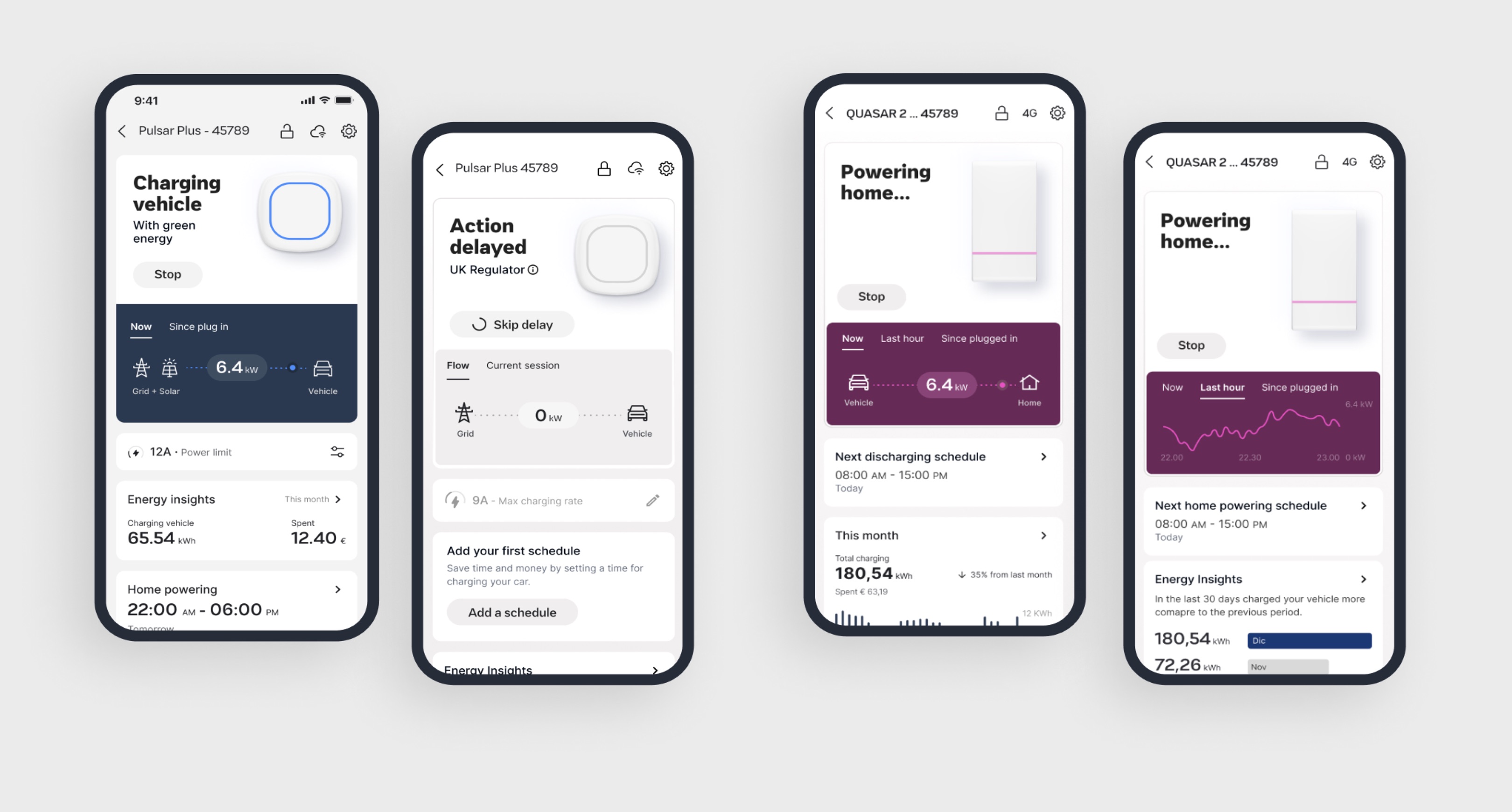
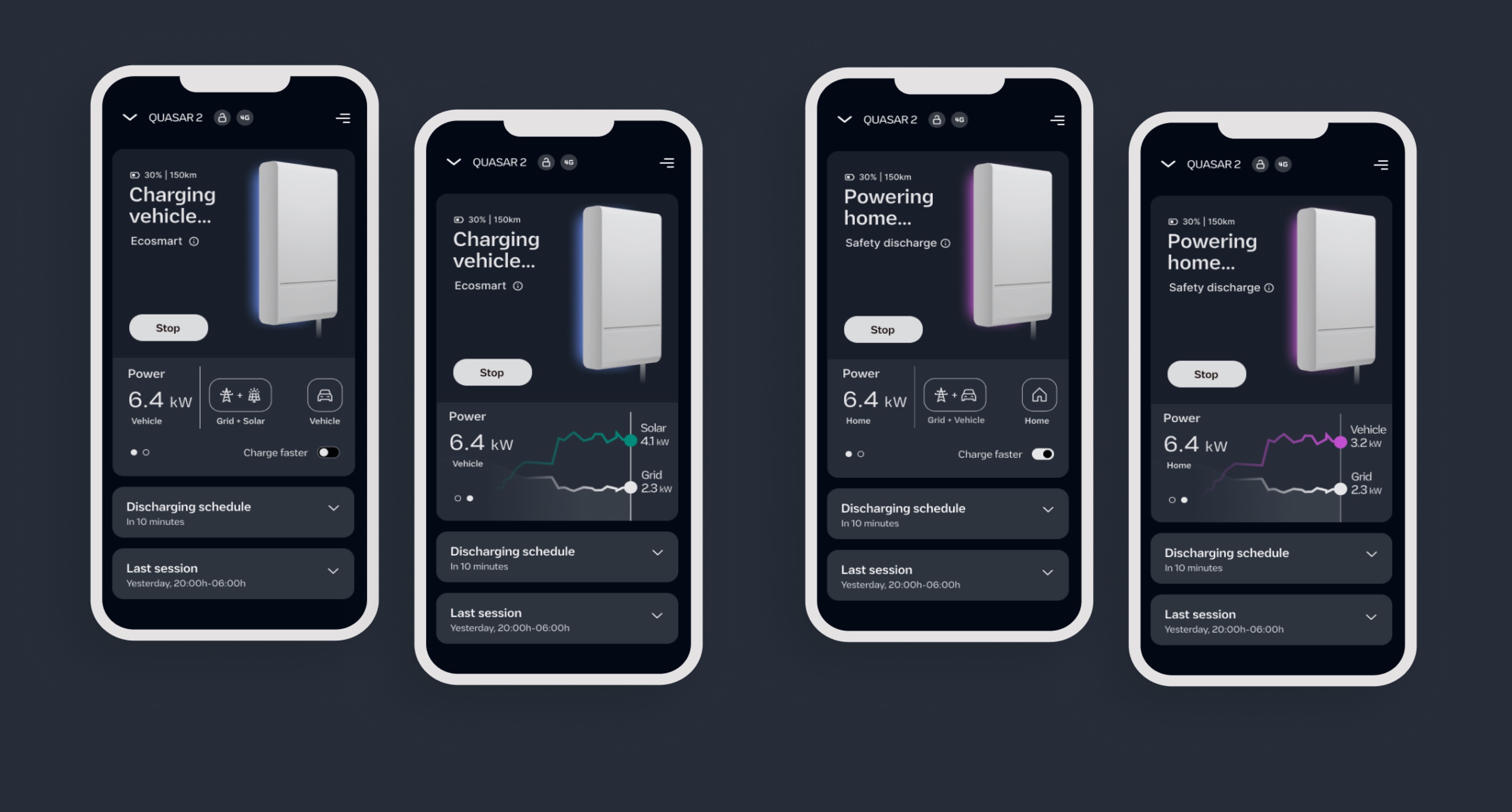
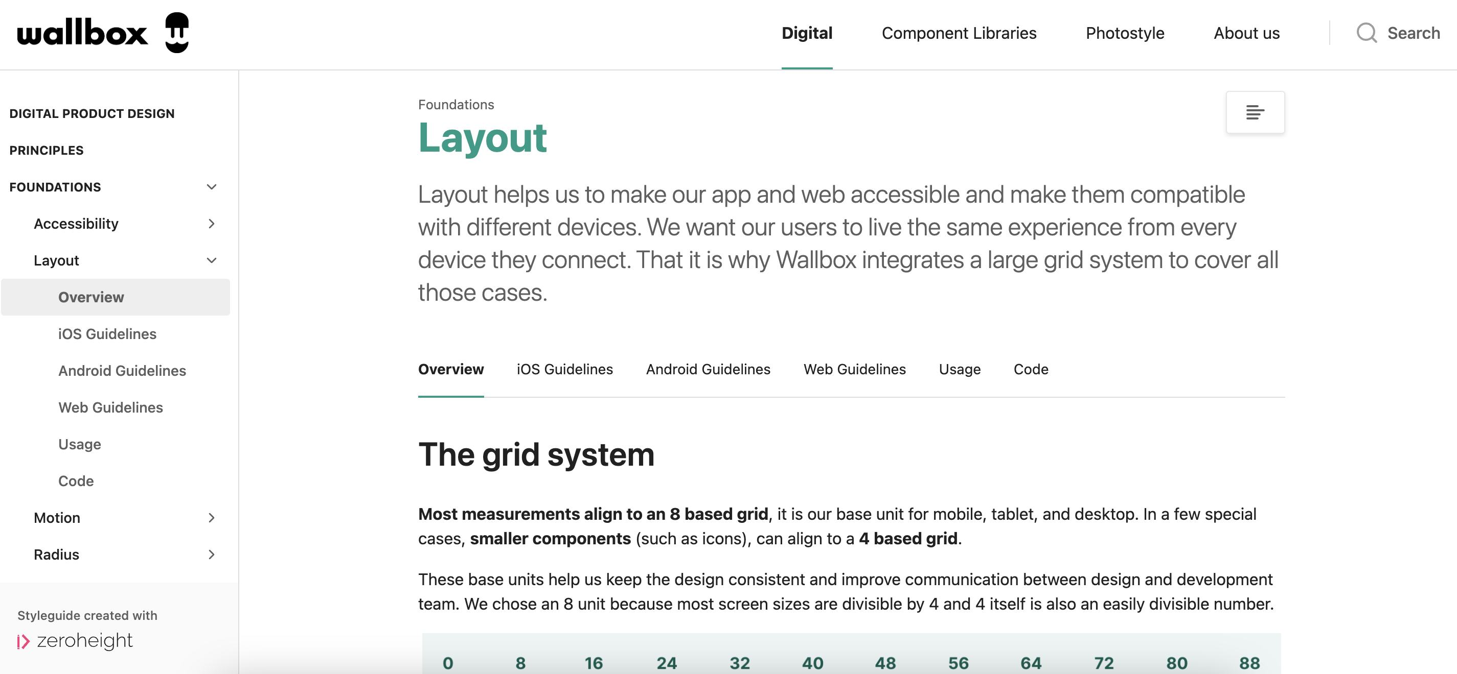
Wallbox design system components in Figma — tokens, components, and documentation structure

The Wallbox design system in Figma — tokens, components, and patterns shared across the consumer app, Business Portal, and HMI surfaces.

01

Foundations

Colour, typography, spacing, and motion tokens. One source of truth that propagated through every component.

02

Components

Buttons, inputs, cards, states, and navigation patterns. Built once, used across all three product surfaces.

03

Patterns

Recurring UX flows — charger status, error handling, scheduling, onboarding — defined once so squads stopped solving the same problems independently.

04

Documentation

ZeroHeight integration so engineering could access specs, usage guidelines, and implementation notes without going through design.

Stop exposing the system.
Start showing the outcome.

84% of all app sessions passed through the Charger Control screen. That became the proving ground — the place to demonstrate what a different approach looked like in practice.

The app had been built from the inside out: it exposed what the hardware was doing, using technical language that made sense to engineers. Users didn't care about amps. They cared about whether their car would be ready for their morning commute. We flipped the model.

Twelve status colours collapsed into four clear states. Jargon became plain language. The information hierarchy shifted to what users needed to act on — charge time remaining, energy cost, green percentage — rather than what the system happened to be doing internally.

What changed Before After
Information model Technical data — amps, raw status codes, system states Outcomes — time to full charge, energy cost, green energy percentage
Status system Twelve colour states with no explanation Four clear states with a plain-language sentence describing what's happening
Available actions All options visible at all times, regardless of context Contextual — only what's actually possible in the current state is shown
Errors Technical error codes that required looking up in a manual Clear explanation of what happened and a suggested next step
Onboarding A setup flow that assumed prior technical knowledge Step-by-step guidance designed for someone connecting their first EV charger

Metrics were the
visible part. The org change was the real result.

The app rating went from 2.6 to 4 stars. Charger-to-app connection reliability rose from 83% to 96%. Delivery speed improved by 40% once the design system was established. These were the numbers that were easy to report.

The harder outcome to quantify was the shift in how design operated at Wallbox. When the project started, design was treated as a service — something called in to make things look better at the end of a process. When it ended, design was embedded in every sprint, across every squad, with a shared system that made that embedding sustainable.

The ceremonies, the system, and the cross-squad rituals didn't disappear when the redesign shipped. They became the way the organisation worked.

Product outcomes

An app that matched the hardware

2.6 → 4★ App Store rating. 83 → 96% connection success. −40% time from concept to shipped feature. Users who had avoided the app started recommending it — which in a category built on word-of-mouth referrals, mattered.

Org outcomes

A design function that could scale

Six designers across three squads working from a shared system. Regular ceremonies that made cross-team dependencies visible before they became blockers. A design team that engineering trusted and product treated as a strategic partner — not a finishing service.

My contribution

Design Manager. Led design across three product surfaces — consumer app, Business Portal, and fast-charger HMI. Built the ceremonies, system, and cross-squad infrastructure from scratch. Managed six designers across three squads while staying hands-on with the app redesign.

"A bad product is rarely a design problem. It's a coordination problem that shows up as design."

The app reflected how the organisation worked: teams building in isolation, each optimising for their own metric, nobody owning the full user experience. Fixing the interface was the visible part. The real work was designing the conditions — shared systems, shared rituals, shared language — that made good product decisions structural, not dependent on a single individual being in the right room at the right time. That kind of infrastructure is what scales when the team grows.

← Previous case When one design has to
feel local everywhere
Next case → Content at the speed
of a global brand