BBVA's app served 20M+ people across 7 markets, each having adapted the product independently over the years. The result was fragmentation: no shared logic, no common language, and no way to ship a global improvement without breaking what each market had built.
As Senior Product Designer, later Innovation Lead, I made local adaptation systematic: UX/UI across 100+ features, plus the documentation, guidelines and design system that became the shared infrastructure. As product owner I then shipped My Trips, the Watch App and the New Landing end to end: the foundation that let eight country teams build at 90%+ component reuse.
BBVA operates across seven markets: Spain, Mexico, Peru, Argentina, Colombia, Uruguay and the US. Each brings its own regulations, competitive pressures and, more subtly, mental models around money.
Take transfers. In Spain people think in monthly cycles; in Mexico salaries are fortnightly and credit cards carry more everyday spending than debit. Same screen, but the hierarchy, defaults and language around credit had to reflect a different financial reality. Get that wrong at 20M users and it isn't a UX problem, it's a trust problem.
I worked across 100+ features (dashboard, transfers, product detail, account management) and supervised the Peru team's adaptation work. The real output wasn't the screens, it was the documentation, guidelines and frameworks that let 8 country teams reuse 90%+ of components without a central bottleneck.
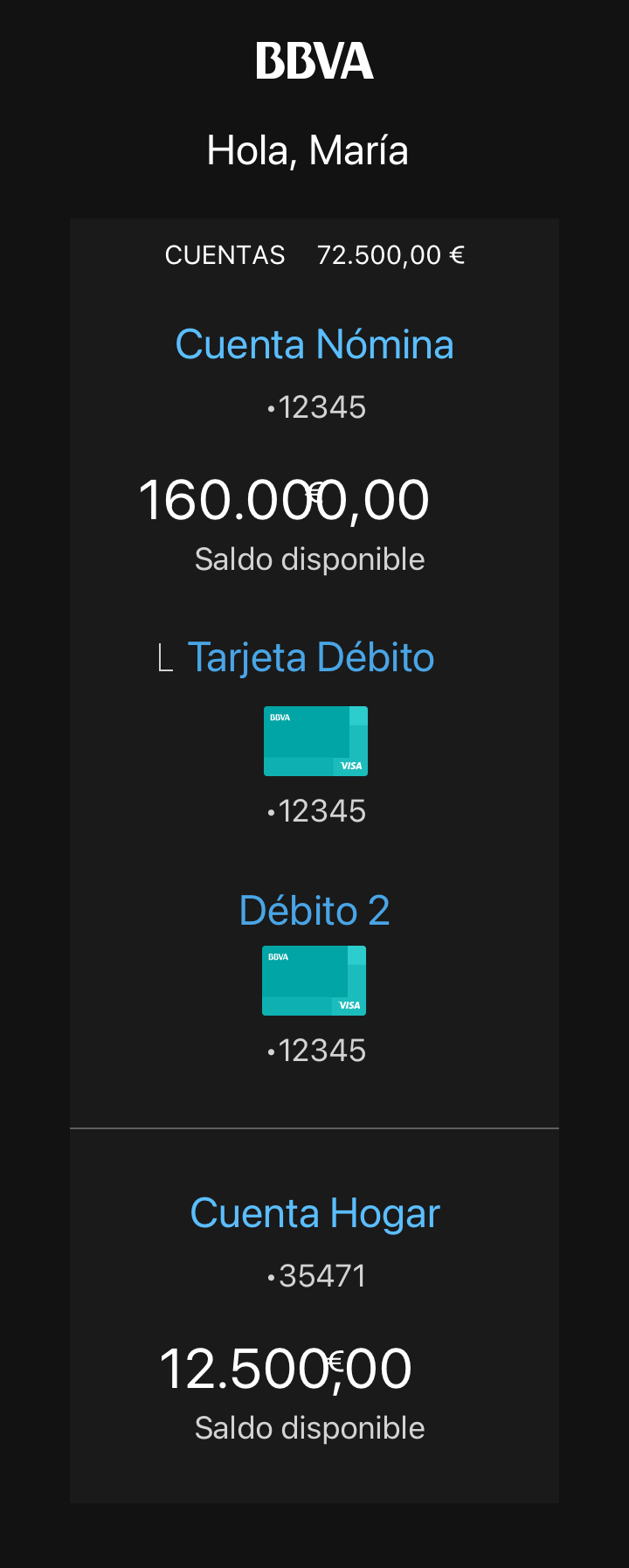
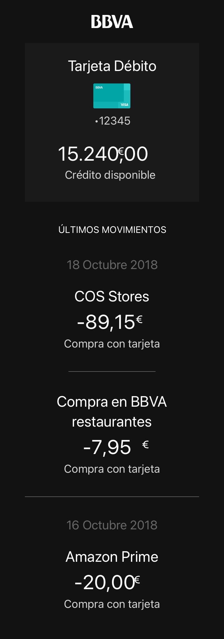
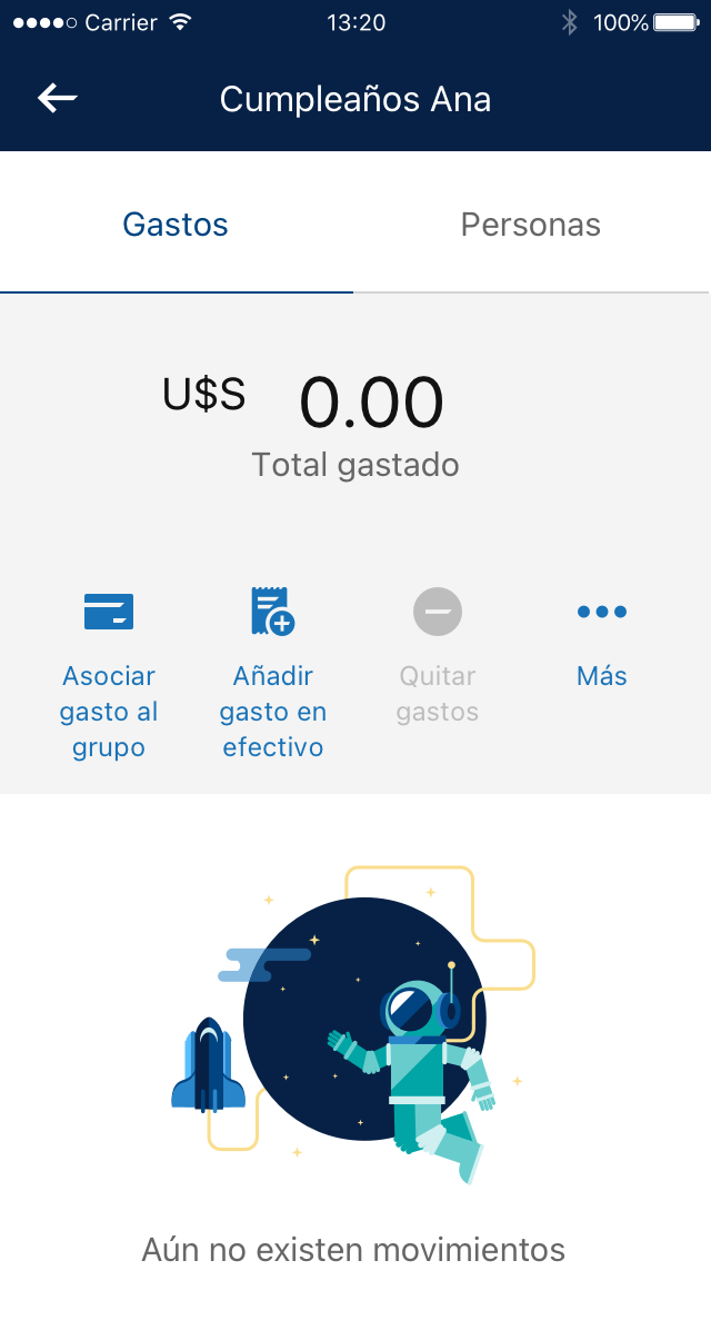
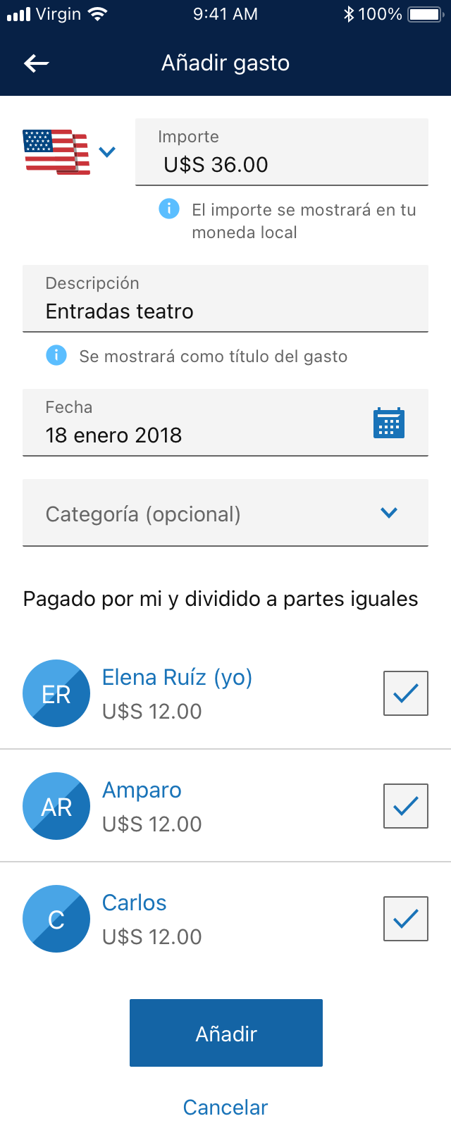
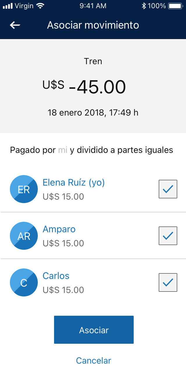
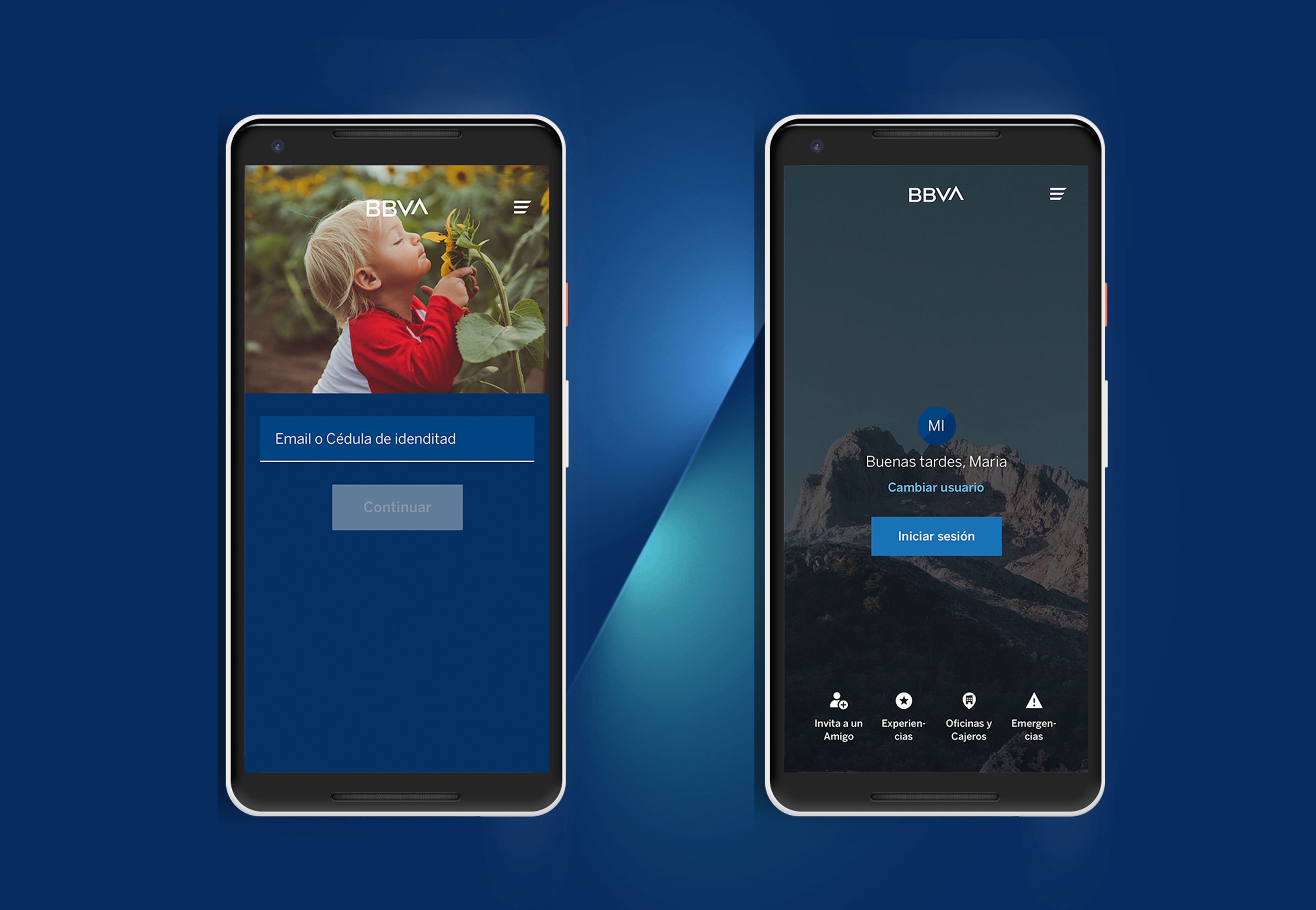
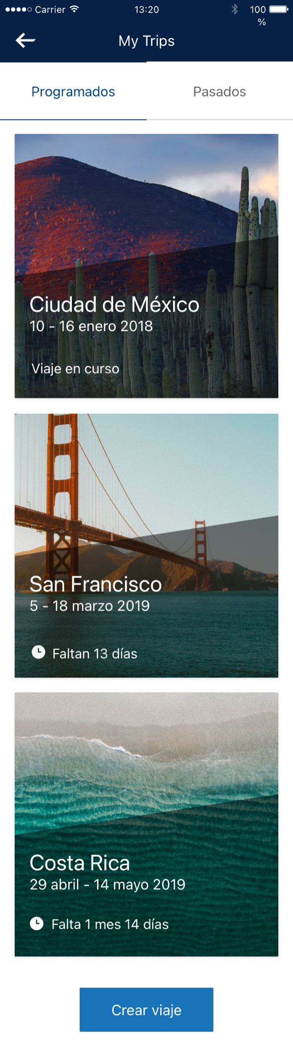
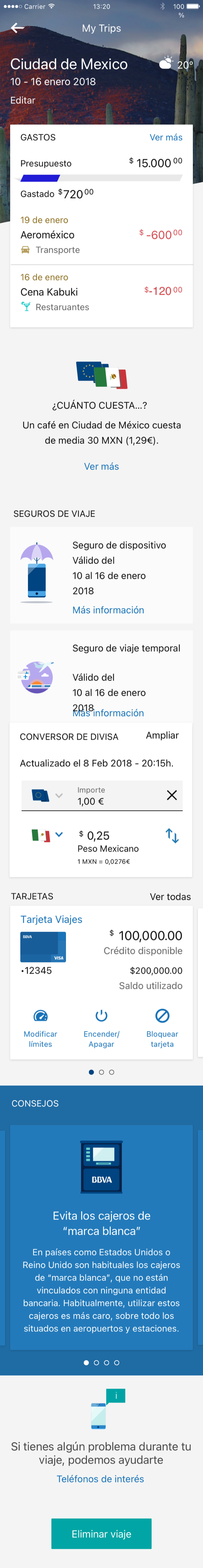
My Trips: tap a destination for automatic expense tracking, currency breakdown and product recommendations.
BBVA had every transaction a customer made while travelling, but users couldn't use any of it, piecing together by hand what they'd spent, in which currency, across trips. My Trips surfaced it automatically: expenses by destination, budget tracking and currency breakdown, all linked to the products they might actually need.
I led it from research to launch in Spain (August 2019). The insight: travel isn't just a moment, it's a financial context. Connecting it to BBVA's products (insurance, loans, currency conversion) turned a utility into a revenue driver.
Android watch and Apple Watch running BBVA: dashboard and product detail at a 42mm size. Dark-mode palette designed from scratch, later adopted as the mobile foundation.
The Watch app wasn't a compressed version of mobile, it meant rethinking what banking means at a glance. What does a user need to know on a 42mm screen, in the three seconds they glance at their wrist?
I led the adaptation for both Android watches and Apple Watch, designing a new dark-mode system from scratch. The 60+ components built for watchOS became the foundation for the mobile dark mode, work that compounded across the platform.
Expenses Group: create a group, associate real bank transactions, split and settle debts without leaving the app.
Three parallel journeys designed simultaneously, BBVA client, non-client with app, and non-client without app, each with different permissions and entry points.
Splitting expenses with friends was a solved problem: Tricount, Splitwise and Venmo all track who owes what. What none could do was close the loop, settling the debt immediately, in-app, because the money was already there. That's the one thing a bank can do that a fintech can't.
I led it from research through design. The core interaction was simple: create a group, add expenses, split them. The real complexity was invisible: not everyone in a group is a BBVA customer. So I designed three parallel experiences at once, an existing client, a non-client with the app and a non-client without it, each with different permissions, entry points and incentives to convert.
The feature shipped two to three years after I left, with small adjustments along the way. The core design held.
Previous landing (left) and the redesigned one with personalised post-login, QR access and communication space (right).
The landing screen is the first thing a potential customer sees, and it has to convert across markets with different propositions, regulations and contexts. The challenge wasn't a good screen, it was a flexible system each market could adapt without losing the brand or the conversion logic.
I led the full experience: information architecture, user flows and visual design. The new landing added a personalised post-login state, surfaced QR operations at the entry point, and created a new communication space between BBVA and its customers that hadn't existed in the app before.